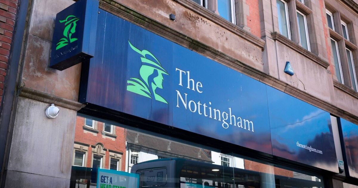
The Nottingham Building Society is facing a backlash after ditching its classic Robin Hood symbol in a modern rebrand aimed at fostering ‘inclusivity’. The firm says the new branding – the logo is now a squiggle – aims to reflect its ambition to better represent ‘society as it is today’.
But customers do not seem convinced, with some calling it a ‘waste of money’ or just a bad idea. The local newspaper editor Natalie Fahy blasted the move ... Read even more


